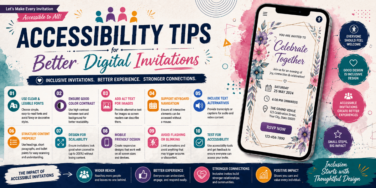
Accessibility Tips for Better Digital Invitations
A digital invitation should be attractive, but it should also be comfortable for as many guests as possible to read and understand. Simple accessibility choices can improve the experience without making the design less creative.
Use Clear Text
Choose fonts that remain readable at smaller sizes. Decorative typefaces can be useful for short headings, but essential event information should use clear and comfortable typography.
Maintain Good Color Contrast
Text should remain easy to distinguish from its background. Light text on a light background or dark text on a dark background can make important details difficult to read.
Do Not Depend Only on Color
If an important instruction or status is communicated only through color, some guests may find it difficult to understand. Use text, icons, labels, or other visual cues alongside color where useful.
Keep Information Structured
Organize the invitation into logical sections. Guests should be able to understand the event name, date, time, location, and other important information without searching through a crowded design.
Use Meaningful Images
Photographs and graphics can strengthen a digital invitation, but they should support the content. Important information should not exist only inside an image when the same information can be presented as readable text.
Make Interactions Easy
Interactive buttons and links should be clearly identifiable and easy to select. Avoid tiny controls or links that are difficult to tap on a phone.
Keep Motion Purposeful
Animation can add personality, but excessive movement may distract guests. Use transitions and effects where they improve the experience rather than making every element move.
Final Thoughts
Accessible digital invitation design is mainly about thoughtful decisions. Readable text, clear structure, suitable contrast, understandable interactions, and controlled animation can make invitations more welcoming.
FAQ
What makes a digital invitation accessible?
Readable typography, clear contrast, logical content structure, understandable controls, and thoughtful use of images and animation can improve accessibility.
Can an elegant invitation also be accessible?
Yes. Accessibility does not require a plain design. Good typography, spacing, contrast, and visual hierarchy can support both elegance and usability.