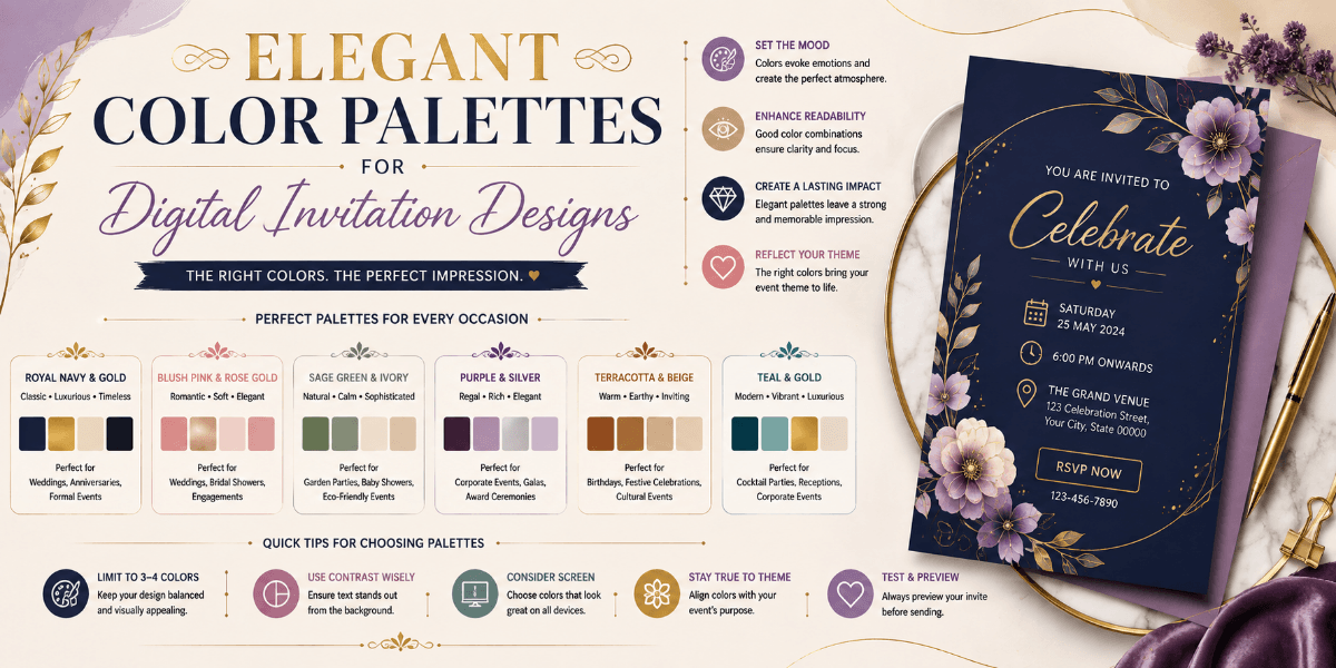
Elegant Color Palettes for Digital Invitation Designs
Color can strongly influence how a digital invitation feels. The right palette can make a design look elegant, festive, modern, traditional, or playful while helping important information remain readable.
Start With the Event Mood
Think about the atmosphere you want to create. Soft colors may suit intimate celebrations, while richer combinations can work well for formal or festive events.
Choose a Main Color
Select one primary color that establishes the visual identity of the invitation. Supporting shades can then be used for backgrounds, accents, borders, and decorative elements.
Add One or Two Accent Colors
Accent colors can draw attention to names, buttons, dates, or decorative details. Keeping accents controlled can help maintain visual balance.
Check Text Contrast
Beautiful colors should still allow guests to read the invitation comfortably. Make sure text has enough contrast against its background.
Match Colors With Images
If the invitation includes photographs, floral elements, illustrations, or other visuals, choose colors that complement rather than compete with those elements.
Final Thoughts
A strong color palette does more than make an invitation attractive. It creates consistency, supports readability, and helps communicate the overall mood of the event.
FAQ
How many colors should a digital invitation use?
A small, coordinated palette is often easier to manage than many unrelated colors. Use primary, supporting, and accent colors with clear roles.
Why is color contrast important?
Good contrast helps guests read names and event details more easily, especially on mobile screens.