What Makes an Event Invitation Easy to Read?
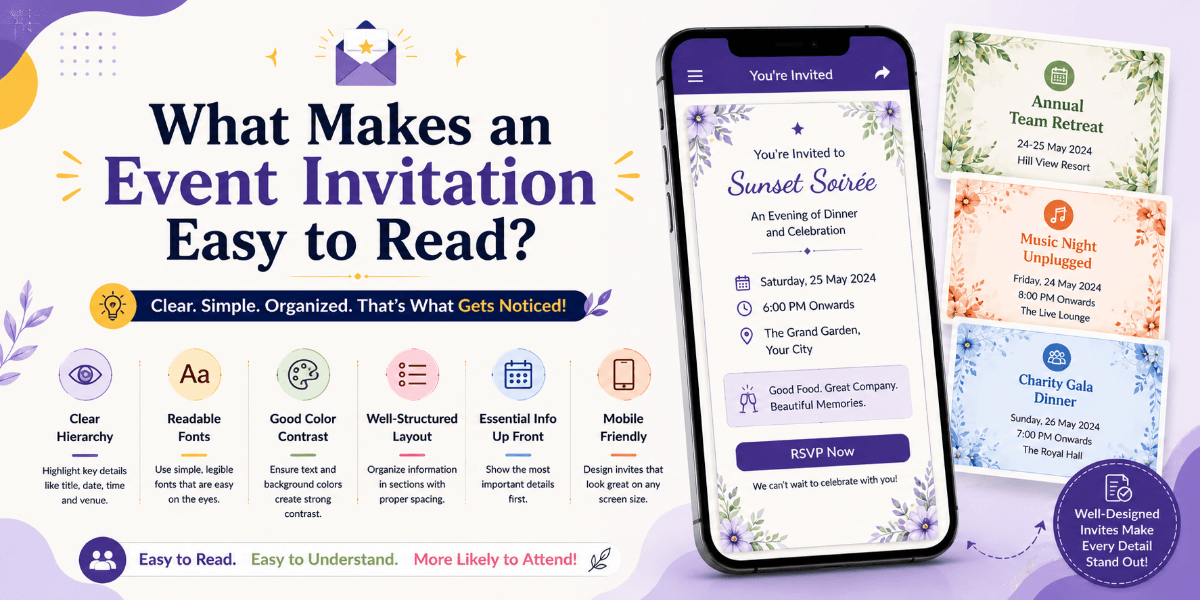
An event invitation can look beautiful and still be difficult to understand. Guests should not have to search through decorative elements or long paragraphs to find the date, time, venue, or RSVP information. Readability is one of the most important parts of effective invitation design.
Create a Clear Information Hierarchy
The most important information should receive the strongest visual emphasis. Event names, dates, times, and locations should be easy to identify without requiring guests to read every line.
Choose Fonts for Reading, Not Decoration Alone
Decorative fonts can add personality, but essential information should remain comfortable to read. Use distinctive typefaces mainly for headings or short phrases and keep detailed information in a clearer font.
Give Content Enough Space
Crowded layouts make invitations harder to scan. Comfortable spacing between sections, headings, and paragraphs can improve readability without making the design feel empty.
Use Strong Contrast
Text should remain clearly visible against its background. Beautiful photography, gradients, patterns, or decorative textures should not interfere with important event information.
Break Long Information Into Sections
Instead of placing every detail into one large paragraph, organize information into sections such as event details, schedule, venue, RSVP, and additional instructions.
Design for Smartphone Viewing
Many guests will open an invitation on a phone. Test text size, line length, buttons, images, and spacing on smaller screens before sharing the invitation.
Make Actions Obvious
If guests need to RSVP, register, view directions, or access another important section, the relevant action should be easy to recognize and use.
Test With Someone Who Did Not Create the Invitation
A fresh pair of eyes can reveal confusing wording, missing information, or sections that are difficult to find. Ask someone unfamiliar with the event to review the invitation and identify what they understand from it.
Final Thoughts
The best readable invitations balance visual appeal with usability. Clear hierarchy, suitable typography, spacing, contrast, and simple navigation can help guests understand the event without unnecessary effort.
FAQ
What is the most important part of invitation readability?
Essential information such as the event name, date, time, venue, and RSVP instructions should be immediately understandable.
Why is readability important for digital invitations?
Guests may view digital invitations on different screen sizes, so clear typography and structured content help them access information quickly.